Ingredients:
Where to buy First Date at the Golden Gate in the USA?
If you can’t find where to buy First Date at the Golden Gate near you, we can easily help you find a place where you can quickly and cheaply buy.
You can click on “check price” button and find out where to buy to buy First Date at the Golden Gate.
How to find the best price on First Date at the Golden Gate?
We are always ready to offer you recommendations on where to buy First Date at the Golden Gate at one of the best price on Internet.
Please, feel free to follow the “check price” button to find price we chose for First Date at the Golden Gate .



lazyBoa7
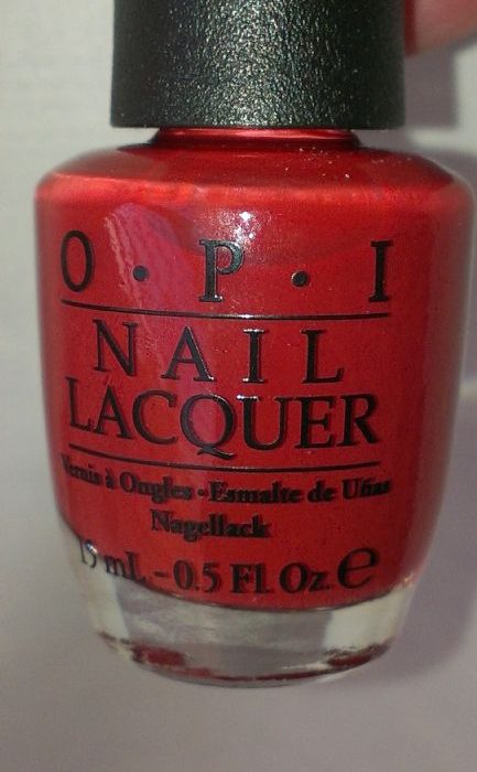
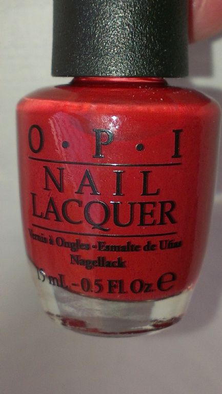
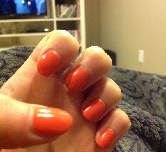
First Date At The Golden Gate is from OPI San Francisco Collection in Fall/Winter of 2013. I have got this polish for 5 years and finally give this one a go. This is a cross between burgundy and maroon. It has a creme finish formula. I find it hard to link this color with brick because it leans more red than orange brown.
I find the application is hard. I use three coats and I can still see some uneveness on my nails. I find that the color doesn’t level out evenly. Some parts of my nails are darker and the other are lighter, no matter how carefully I apply the polish. The formula leans a bit towards the thin side. I don’t understand why OPI constantly changes its formula. I find that if the formula is good, they should stick to it so at least people will find it a lot easier to apply.
I do like the color as it is a good color for late autumn/early winter or late winter/early spring. I wear it at work and have some compliments from coworkers. They said that this is a very attractive color. However, I do have heaps of similar polishes like First Date At The Golden Gate and they do give a better finish, I will choose not to buy this one again.
lovesickDunbird2
Mid-toned ruddy color: even mixture of brick red, chili, cinnamon, and earthy brown. Hard to describe the color because no one color dominates; it warms and darkens with each coat you layer, but the effect is very southwestern red rock…so earthy, so beautiful. If you have warm skin and like earth tones, especially red-browns, you will not be disappointed. (It is very similar to Crepes Suzi-ette in formula, tone, and color, but First Date has more red in it.) I wear it year round. Summer may be my favorite because it looks spectacular with a little tan, light neutrals and turquoise.
Some comparisons of ruddy colors:
Application: it’s a crelly, so I think 3 light coats is ideal. First coat: you see the lovely Golden Gate Bridge brick red-orange. I would love to have lacquer of just this color! Second coat: now you see it as more of a warm chili brick red. Third coat: now it is opaque, with a darker cinnamon brown added in. This is probably one of my best chip resistant formulas.
5 lippies. Love it so much I bought a backup of both this and its sister, Lost on Lombard. Wondering the difference? Lombard is darker, redder, take out the touch of orange and replace it with a touch of burgundy (I think that’s what I see), add some ladylike mystery, a little sex appeal, and viola! Both are work appropriate and classy, neither scream “hey I’m red”.
lovesickViper8
I love this. I got it in the fall just before a California coastal cruise took us to San Francisco and the Golden Gate this is named for. Couldn’t resist.
And true to it’s name with 2 coats this brick red creme polish is exactly the shade the bridge is painted. Postcard pretty on the bridge and on the nails. Very skin friendly tone, looks good and makes my hands and feet look nice too. I’m a NC15-20 warm pale redhead and this is terrific.
The hint of rust gives it a toned down wearable red without being a screechy tomato red. It makes the skin look really good next to it, and it looks classic with a twist.
I bought a second bottle because when OPI creates one I love, they discontinue it. (I miss you Baguette Me Not) and I’ve learned that lesson. When you love a shade, quick, buy a spare, you never know when they are going to take it into their heads to discontinue a beauty.
Wears well. But being a creme and a red, chips or tip wear shows, however this is easy to add a thin line to the tips of the mani or pedi and it doesn’t show badly.
Needs 2 coats though. First coat goes on streaky and almost a bricky rose shade, but it hits it’s stride on the second coat.
sheepishBuzzard1
First Date At The Golden Gate is from OPI San Francisco Collection in Fall/Winter of 2013. I have got this polish for 5 years and finally give this one a go. This is a cross between burgundy and maroon. It has a creme finish formula. I find it hard to link this color with brick because it leans more red than orange brown.
I find the application is hard. I use three coats and I can still see some uneveness on my nails. I find that the color doesn’t level out evenly. Some parts of my nails are darker and the other are lighter, no matter how carefully I apply the polish. The formula leans a bit towards the thin side. I don’t understand why OPI constantly changes its formula. I find that if the formula is good, they should stick to it so at least people will find it a lot easier to apply.
I do like the color as it is a good color for late autumn/early winter or late winter/early spring. I wear it at work and have some compliments from coworkers. They said that this is a very attractive color. However, I do have heaps of similar polishes like First Date At The Golden Gate and they do give a better finish, I will choose not to buy this one again.
grudgingGelding4
Mid-toned ruddy color: even mixture of brick red, chili, cinnamon, and earthy brown. Hard to describe the color because no one color dominates; it warms and darkens with each coat you layer, but the effect is very southwestern red rock…so earthy, so beautiful. If you have warm skin and like earth tones, especially red-browns, you will not be disappointed. (It is very similar to Crepes Suzi-ette in formula, tone, and color, but First Date has more red in it.) I wear it year round. Summer may be my favorite because it looks spectacular with a little tan, light neutrals and turquoise.
Some comparisons of ruddy colors:
Application: it’s a crelly, so I think 3 light coats is ideal. First coat: you see the lovely Golden Gate Bridge brick red-orange. I would love to have lacquer of just this color! Second coat: now you see it as more of a warm chili brick red. Third coat: now it is opaque, with a darker cinnamon brown added in. This is probably one of my best chip resistant formulas.
5 lippies. Love it so much I bought a backup of both this and its sister, Lost on Lombard. Wondering the difference? Lombard is darker, redder, take out the touch of orange and replace it with a touch of burgundy (I think that’s what I see), add some ladylike mystery, a little sex appeal, and viola! Both are work appropriate and classy, neither scream “hey I’m red”.
dopeyFerret7
I love this. I got it in the fall just before a California coastal cruise took us to San Francisco and the Golden Gate this is named for. Couldn’t resist.
And true to it’s name with 2 coats this brick red creme polish is exactly the shade the bridge is painted. Postcard pretty on the bridge and on the nails. Very skin friendly tone, looks good and makes my hands and feet look nice too. I’m a NC15-20 warm pale redhead and this is terrific.
The hint of rust gives it a toned down wearable red without being a screechy tomato red. It makes the skin look really good next to it, and it looks classic with a twist.
I bought a second bottle because when OPI creates one I love, they discontinue it. (I miss you Baguette Me Not) and I’ve learned that lesson. When you love a shade, quick, buy a spare, you never know when they are going to take it into their heads to discontinue a beauty.
Wears well. But being a creme and a red, chips or tip wear shows, however this is easy to add a thin line to the tips of the mani or pedi and it doesn’t show badly.
Needs 2 coats though. First coat goes on streaky and almost a bricky rose shade, but it hits it’s stride on the second coat.
murkyTacos3
This polish is a creamy brick red that has no shimmer or pearliness, and suits my MUFE120/Color IQ 3Y05 skin tone. It wears well with a base and top coat, but looks best with at least 3 coats. It doesn’t get streaky, but looks a little uneven with only 2 coats. OPI flat brush gives good coverage.
wornoutCaribou8
I absolutely ADORE this OPI color.
I managed to snag this one on clearance at Target, and I decided to try it only because the red looked rather muted and had a ‘brick’ color to it, rather than the nasty pink based reds or blue based reds that can be a bit too dramatic. I typically wear mid-dark blues, greys, blacks or very deep, almost burgundy red on my nails, while I save the really bright polishes for my toes.
I used this polish on my toes and I fell in love. Against dark cafe-au-lait skin like mine, it really pops and looks gorgeous and classy, and just a tiny bit vampish. I could easily see myself wearing this with an all black outfit on a date with just a statement silver necklace. For me it has a really nice, ‘witchy’ kind of feel to it. I feel like a dangerous and mysterious lady when I put this polish on. This is one of the rare reds that I am not afraid to wear on my nails. These would be spectacular if paired with modest stiletto nails.
Since I purchased this on clearance, I can’t speak to the price. I believe I got it for $5.60? Usually OPI runs about $8.99 in California, so I figure I got a steal. The packaging is typical OPI, nothing to write home about. I really wish I had explored more of their San Francisco line of colors before they were discontinued. If they were all as pretty as this shade is, I definitely missed out.
annoyedSalami2
This is my favorite red polish because I feel like it’s ‘true red’ without having a blue undertone. Blue-toned red looks really bad on me whether it’s nail polish, lipstick, clothing, or anything else. I don’t think this color is orangey, it’s just a nice warm, deep red. I like to wear it with Mac Chili lipstick since it’s a similar kind of color.
contentTeal5
I bought this only because it was part of the San Fran collection. In the bottle it was only meh. I pulled it out tonight after several months to give it a try and fell in love instantly. The warm brick color is amazing on my fair skin, plus it was a dream to apply. I got the best color depth after 3 coats, but 2 coats would have done fine. It dried quickly and is now in my permanent rotation (i have a 200+ OPI’s). It is a great color and i highly recommend it!
trustingOcelot1
This polish is the perfect vampy, brick red. It turns out to be much more dark red than orange or “brick” colored as it appears in the bottle, but it is still very far from any classic reds I have. I purchased this along with a few others from the same collection, and I am in love! First date at the Golden Gate in particular goes on smooth and creamy, and is opaque in 1-2 coats. Used with TC and BC, I have experienced minimal chipping and tipwear. All together, a fabulous fall polish, and dare I say a must have!
puzzledIguana2
This is my second polish from OPI’s fall 2013 San Francisco collection. This beautiful warm brick red polish is a must have color for fall. It’s a classic muted brick red creme with warm brown tones. This brings to mind maple leaves as they turn from golden to red in the autumn. The formula applied beautifully but wasn’t as opaque as I expected so it took 3 coats of polish to bring out the richness and beauty of this pretty polish. I’m not much of a red polish person, but this isn’t really a true red, it’s a brick color and a very warm shade. I am really liking this on my hands. With fair skin I tend to get a really washed out look wearing strong or darker shades, and red is especially difficult for me to wear, but this one looks fabulous on me.
jubilantBoars5
Beautiful mid-tone brick red! This is actually a great dupe for my favorite fall red, Chanel Rouge Fatal.